Project description
Science Mouse is an app, dedicated to finding scientific research projects everyone can contribute to online. It doesn't require a scientific degree and anyone who is interested in science can help researches to sort and classify an information, make assumptions, find patterns in data etc.
Project goal
Encourage people to help researches around the world make a process fun and engaging.
My role
UX Researcher & UX/UI Designer.
Target audience
Science enthusiasts with smartphones.
Research
Personas
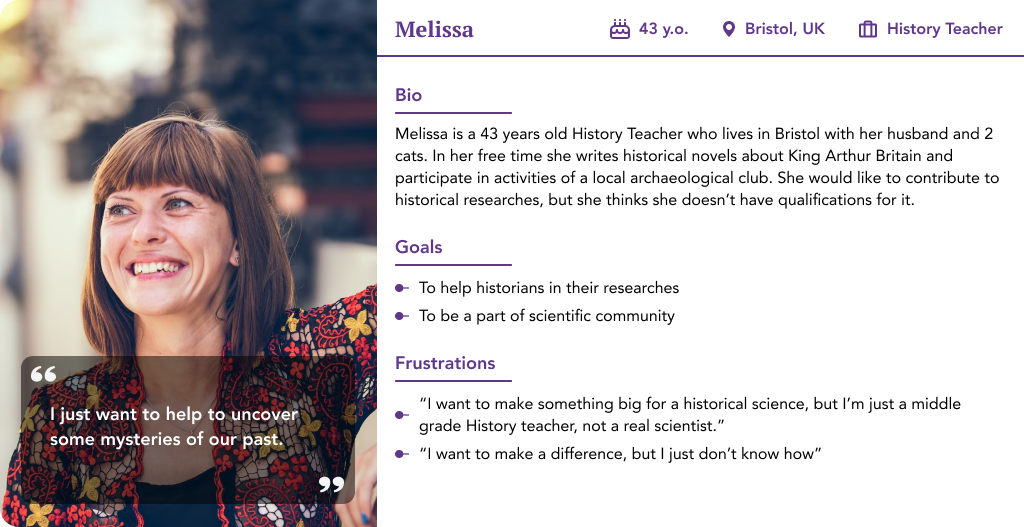
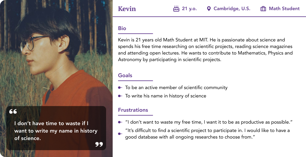
I made a primary research to gather the information about potential users among my friends and people who are already participating in such activities. It turned out, there are two big groups of helpers. I've created two personas with different needs and pain points to represent them. First one is Melissa. Melissa is a history teacher at school. She loves history, but doesn't consider herself a scientist or a researcher. She wants to help "real" historians, but just doesn't know how. She needs a simple and engaging tool that would encourage her to participate in different activities. Melissa is my main user, and I based a userflow on her needs. Kevin is representing another big group of helpers. I can call them "geeks". They are scientists and researchers or highly educated amateurs who are deeply engaged in a theme. Their needs are more specific and they usually don't need further engagement, they just need a database with all projects that suit their interests.
Key challenges
My key challenge was to marry fun and science. The process of participating in projects should be engaging and entertaining, but not overly simplified, so the users who are deeply interesed in science could get all the important information.
Ideation
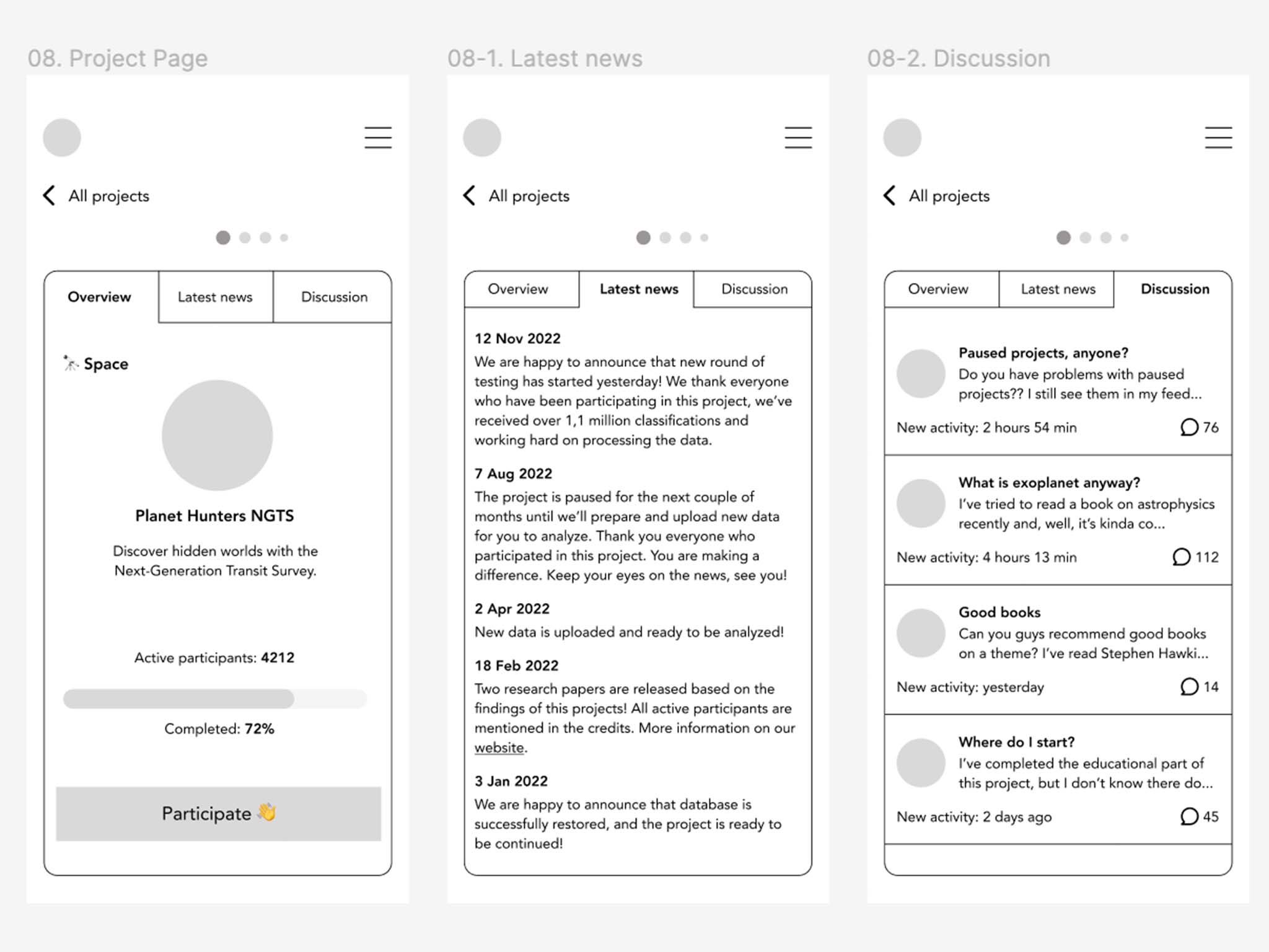
A competitive audit showed that there is only one app that tries to solve this problem: Zooniverse. It allows you to browse scientific projects and easily help researchers around the world. Although while using this app, I've encountered some problems. Firstly, the UI is not great in showing the project's status. Some of the projects are paused, some of them finished, some are out of data, but there is no way you can find it out on a project list. Secondly, there is no engaging factors. You have some kind of progression bar, but I have no idea how is it working. And you don't get any achievements or encouragement to open an app daily or to participate in "one more" project. So I've decided to base my wireframes on these findings and solve some of the problems.
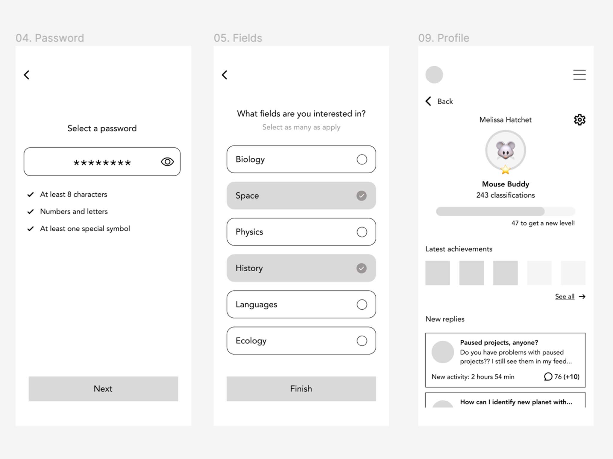
Wireframes
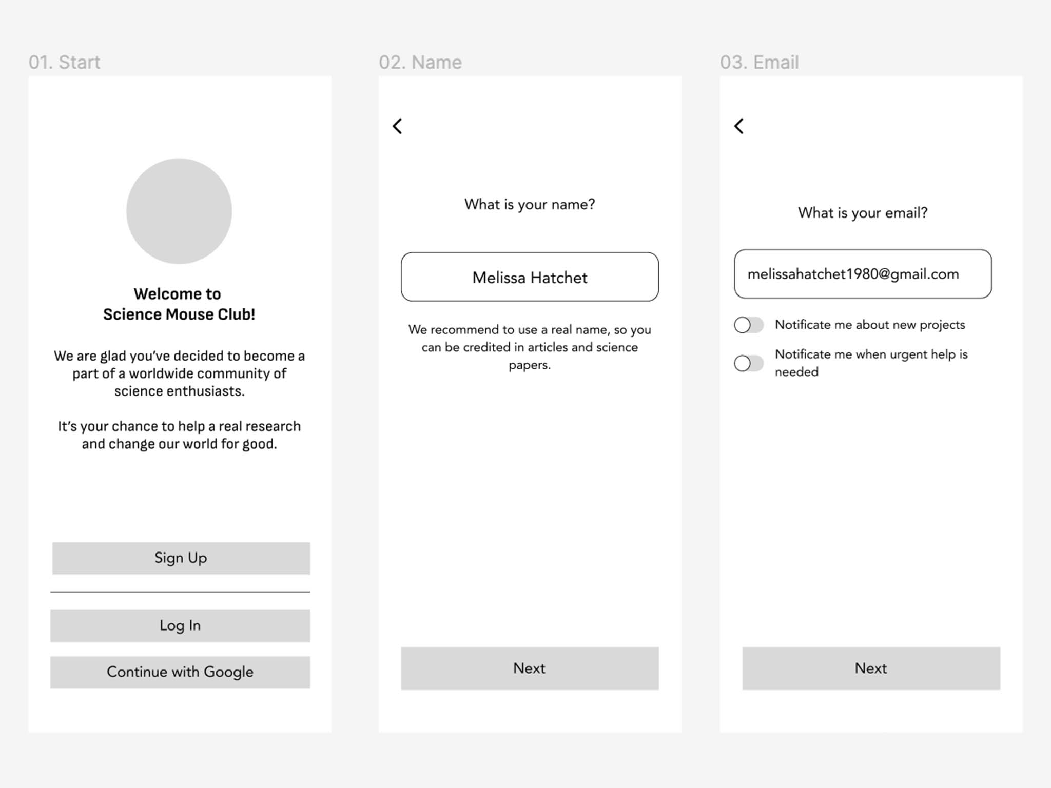
Testing
I've tested a low-fidelity prototype during a moderated usability study with four potential users and found out:
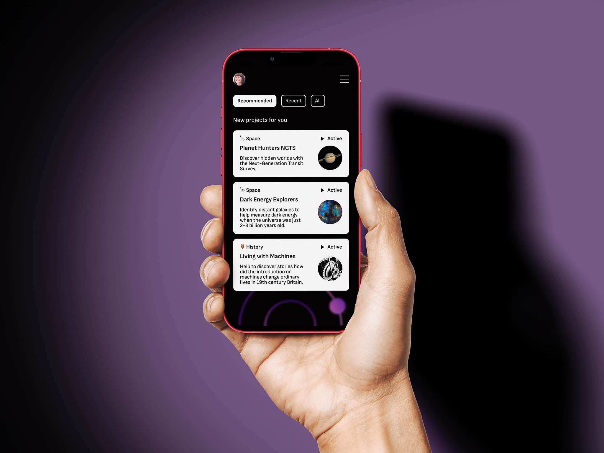
1) Navigation is pretty good and nobody had a problem with finding the right project, but I should think one more time, what I really want to prioritize - 'Recommended' or 'Recent' projects.
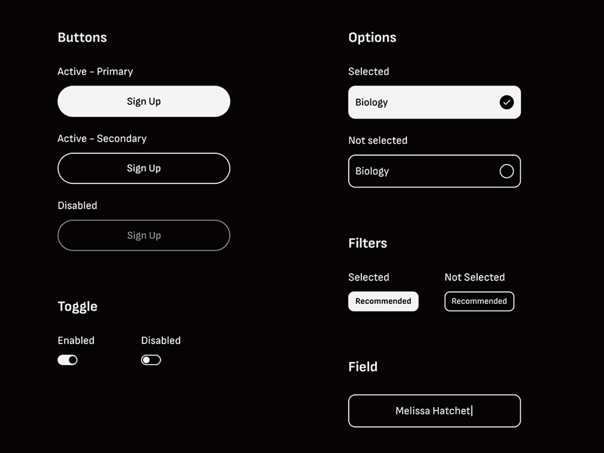
2) Buttons could be bigger. They always could.
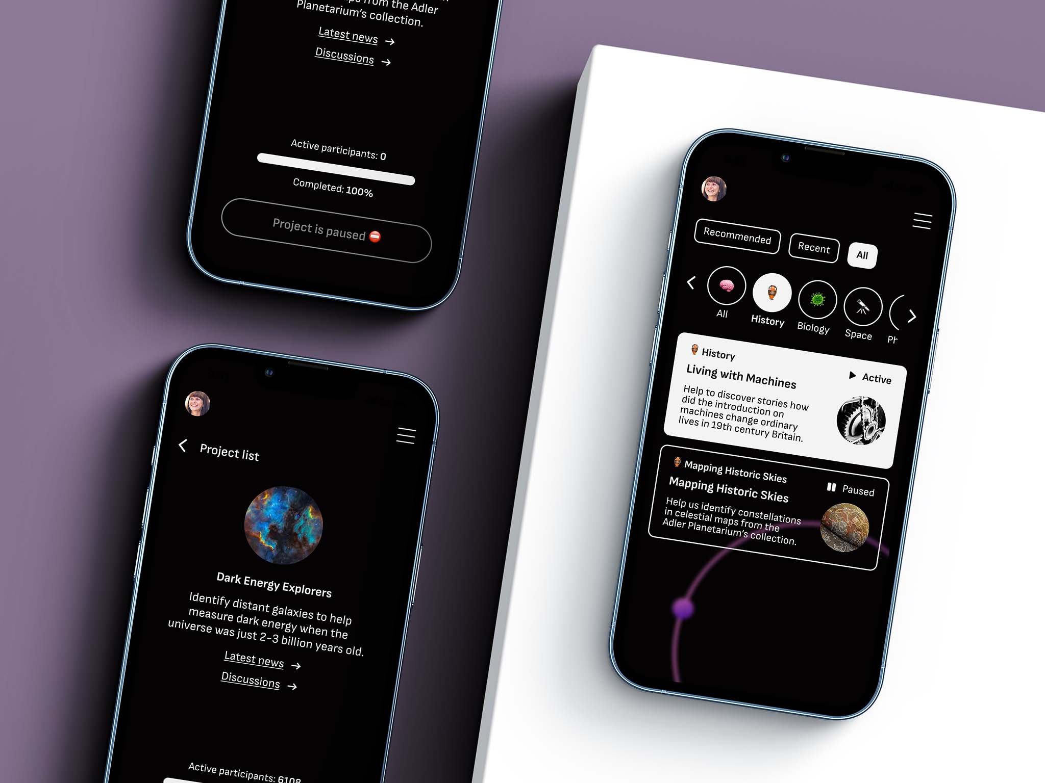
3) Information about user's level and achievements is excessive. There is no need to repeat it twice.
4) I should add social interactions between users. I've decided to add 'Discussion' section to every project, but in future iterations I should also add 'Friend', DMs and, maybe, blog.
Refining the design
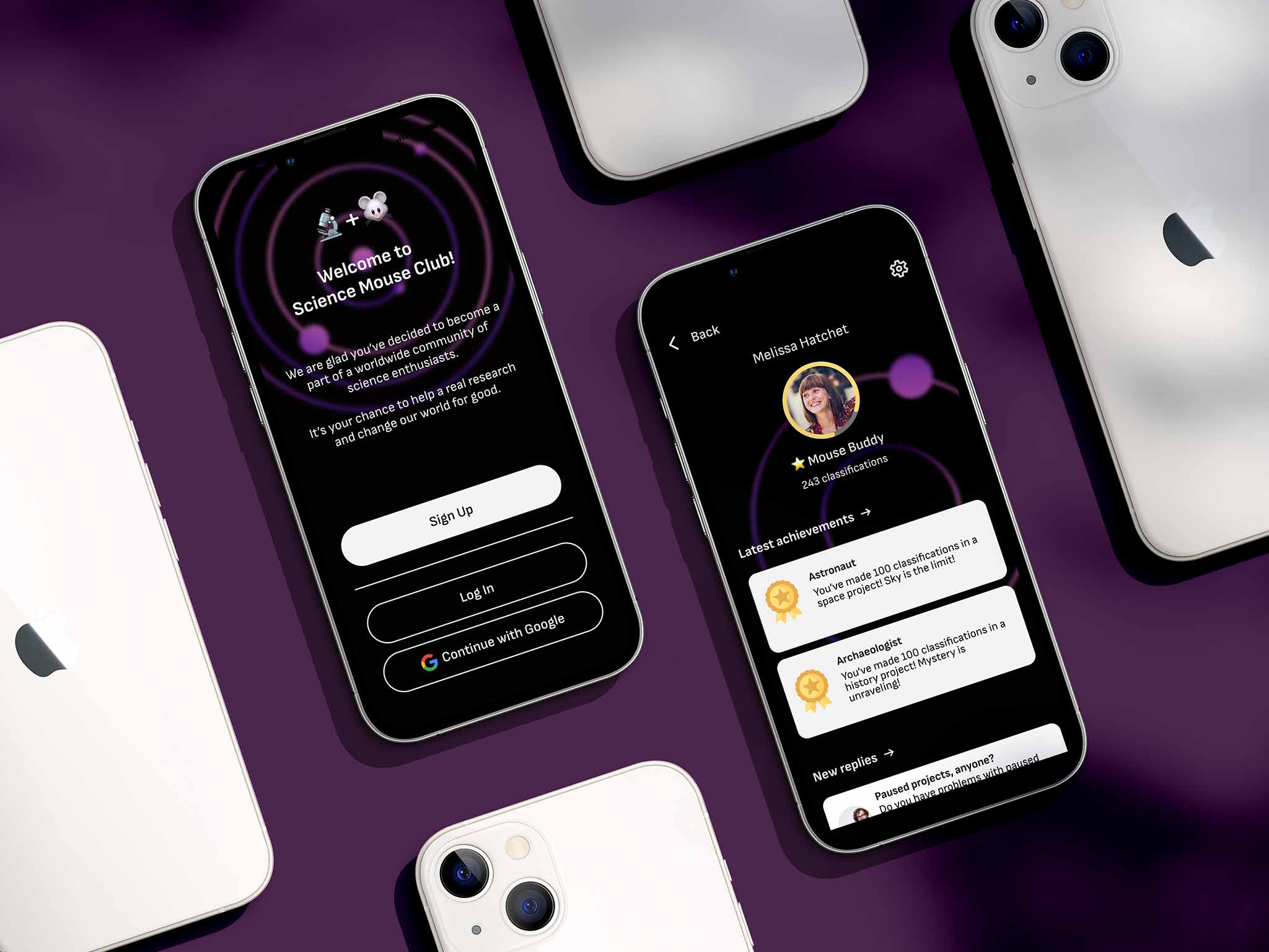
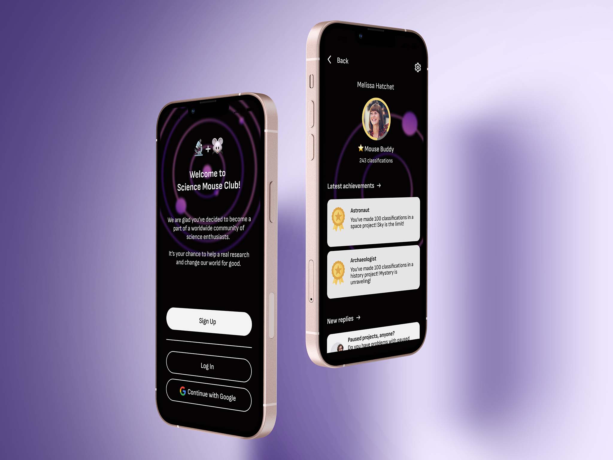
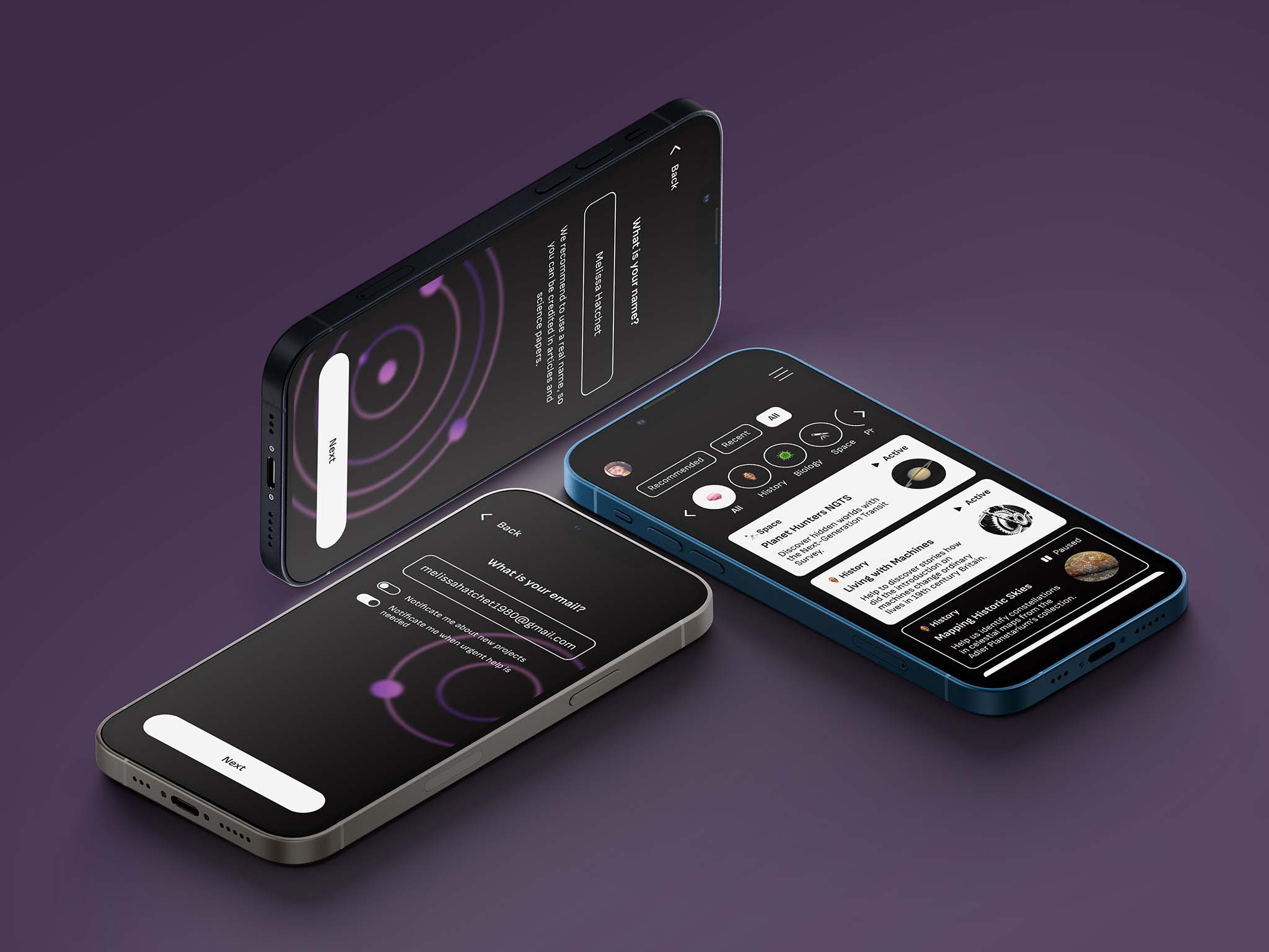
After usability study I've refined my wireframes and created final (for now) mockups.
Mockups
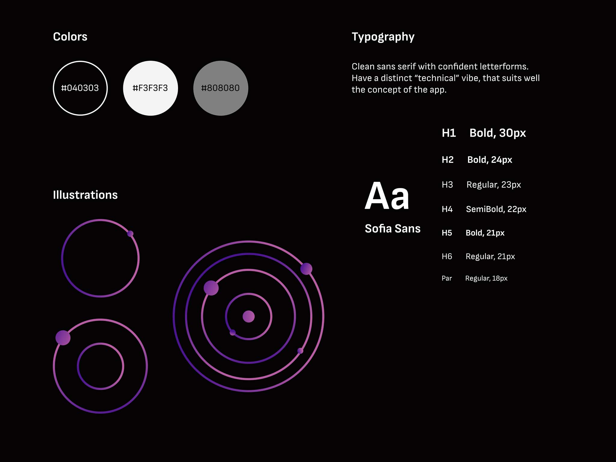
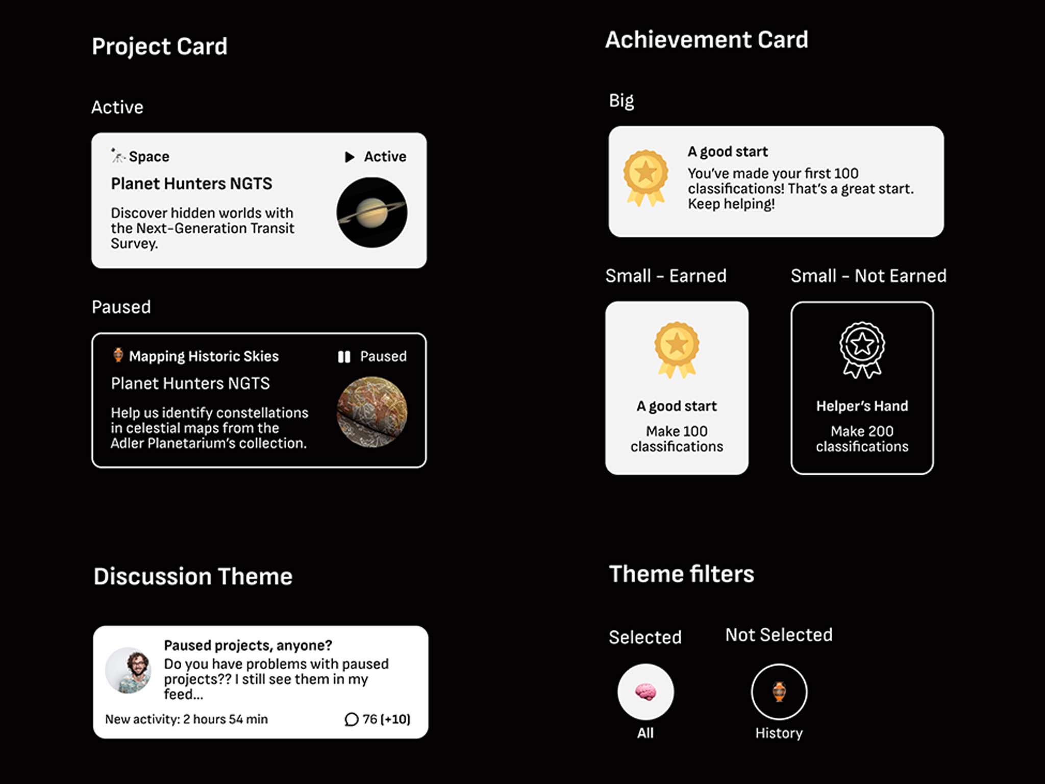
Design System
Takeaways
Final thoughts
The main struggle I had during this project is: how to make a design attractive keeping it as simple and clean as possible. I kept in mind that most projects will involve interpreting important colorful data, so I avoided using color in the design. I used only basic dark, light and grey colors so they would not distract users. It was hard and I've couldn't help myself and added some purple graphics, but I'm not sure it's a good idea. I may need another round of usability study to find out how distracting it actually is.