
Project description
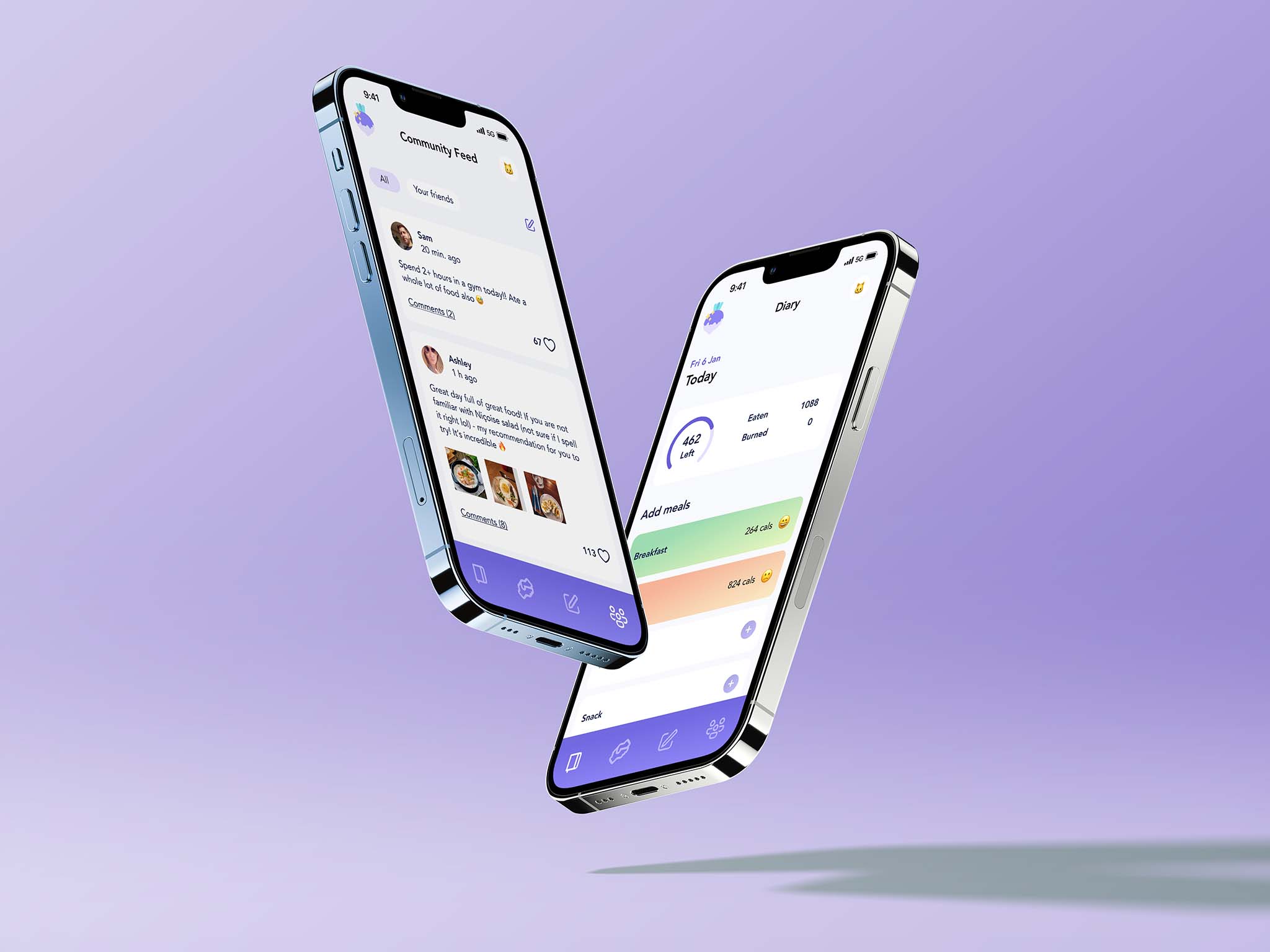
"Rutabaga" is an app for booking an online appointment with a nutritionist, keeping a food diary and finding friends who are also into a healthy eating.
Project goal
The goal of this app is to provide adults with a scientific information about healthy eating and nutrition and to give them an opportunity to receive a professional help on the matter.
My role
UX Researcher & UX/UI Designer.
Target audience
Adults, who are concerned about their health and eating habits.
Research
Personas
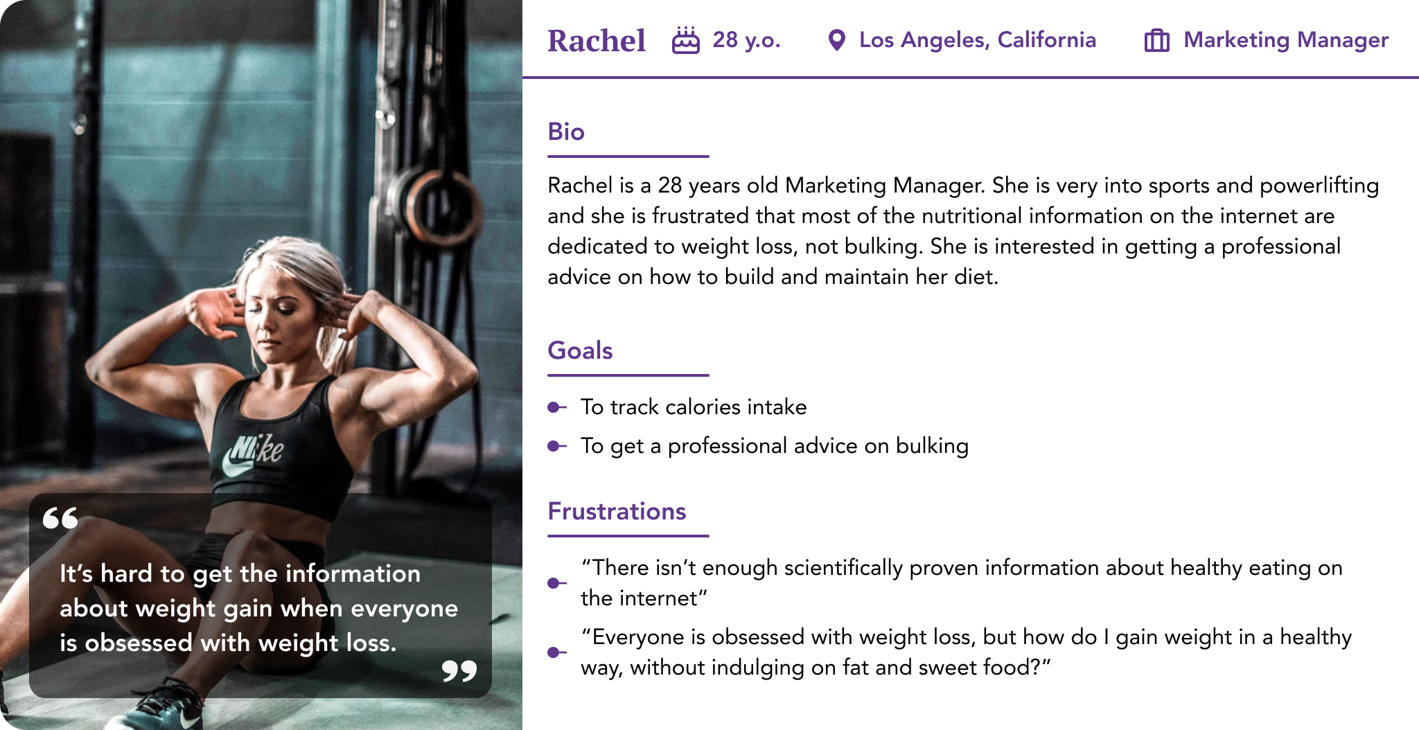
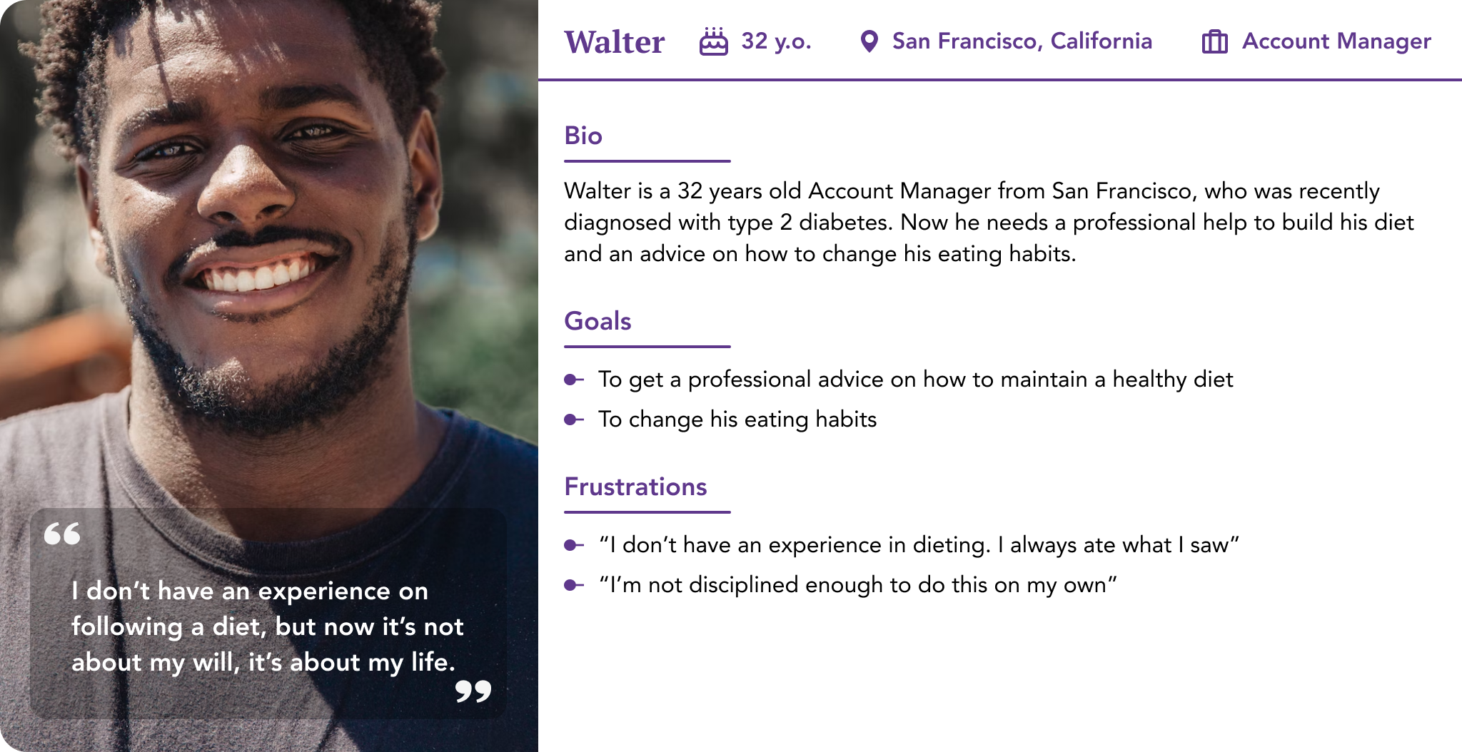
I made an initial research among my friends and on existing platforms dedicated to healthy eating and created two personas with different problems. I found out that most of the users on these platforms track calories to lose weight, and users, who are underweight due to malnutrition or mental health struggles, don't have enough information about how to gain weight in a healthy way and feel pressured and undervalued. So my first persona is Rachel, who needs to gain weight for her sport activities. The second persona is Walter, who was recently diagnosed with type 2 diabetes and don't have any knowledge about healthy eating or maintaining a diet. He needs a professional advice and a constant guidance to stay healthy.
Key challenges
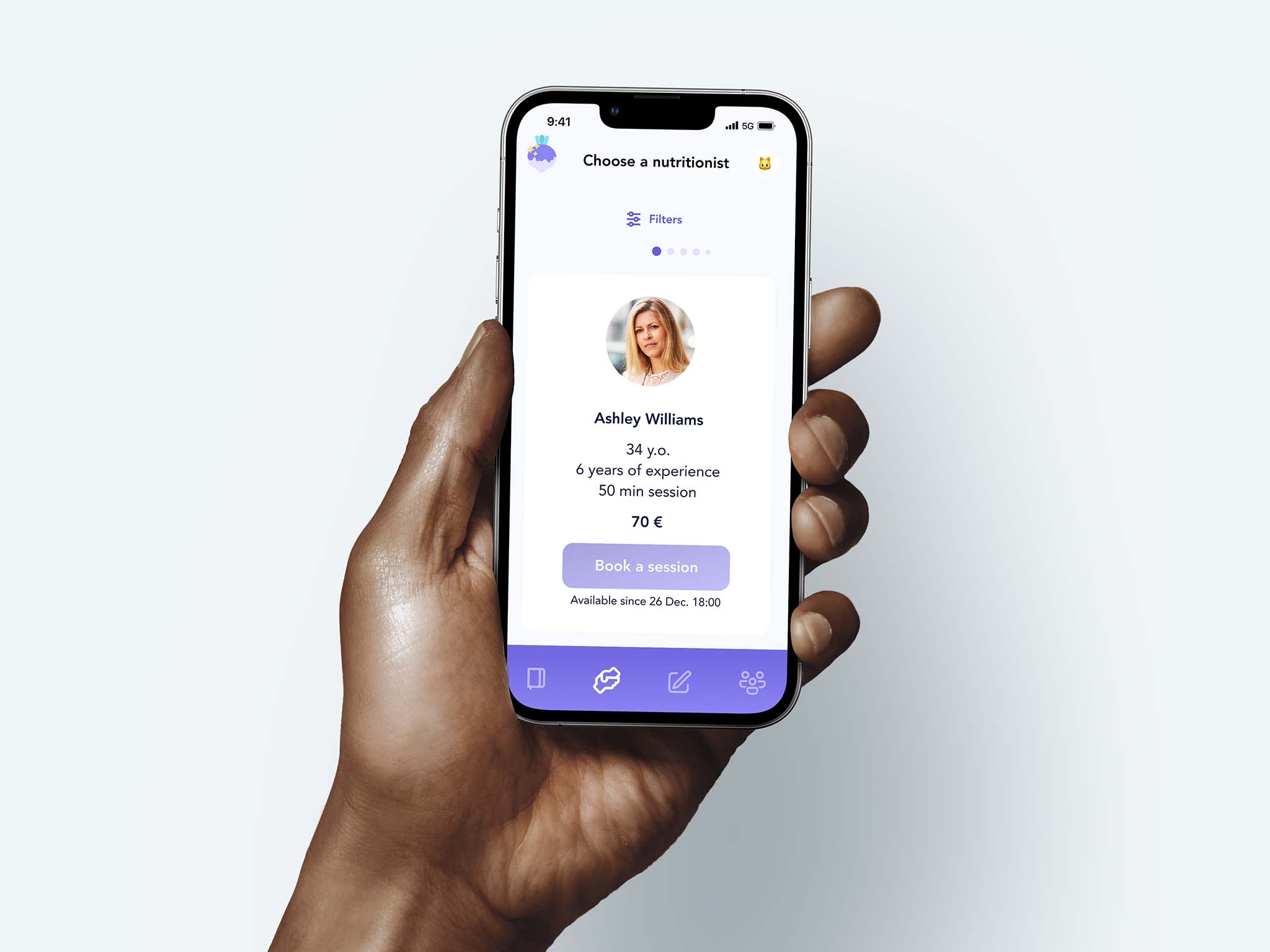
My key challenge was to make the process of booking a nutritionist simple and casual. Since it's an absolutely new experience for most users it should be made as stress free as it's humanly possible.
Ideation
I've conducted a competitive audit exploring both direct competitors such as other healthy eating apps on the market (Lifesum, Yazio etc.) and indirect competitors dedicated to breaking an addiction and psychological help. Based on the finding and list of features, I've created the first set of wireframes.
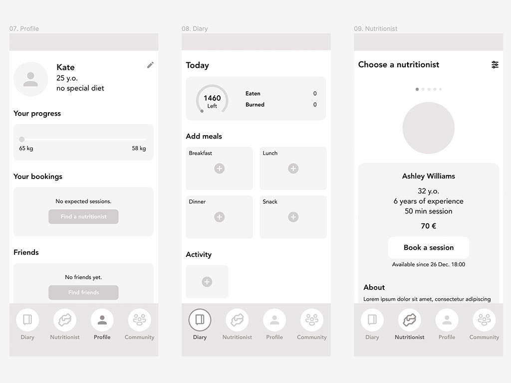
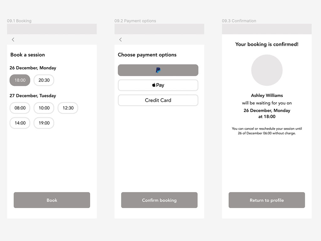
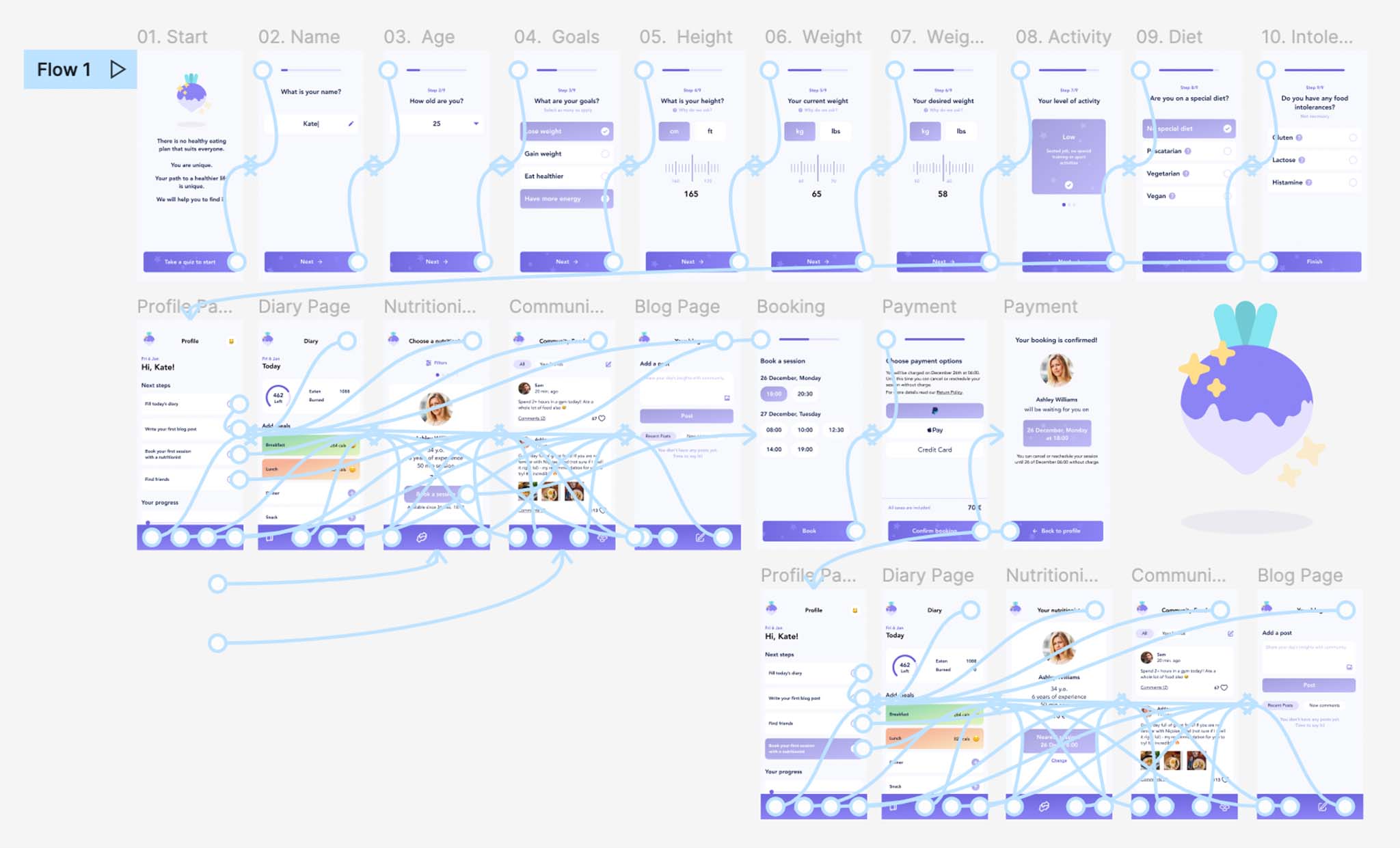
Wireframes
Testing
After creating a low-fidelity prototype in Figma, I've conducted a moderated usability study with 8 potential users who were asked to perform tasks within the app. The usability study showed some problems with a profile page and a booking page.
Pain points and insights
More explanations are needed: most users reported that they needed more information about choosing options such as what is a vegat diet, low level of activity etc.
Clearer payment information: most users reported that they needed a clear information about when exactly they will be billed and are the taxes included in the price.
User flow problems: some users felt lost on the menu and needed clearer entry points.
Refining the design
Considering the feedback I've received, I've refined the designs and created mockups.
Logo

For this project I've decided to draw a vector logo myself. I tried to keep it minimalistic so it would look good even in a tiny size. I'm not great with vectors, but I liked the result. To be honest, it's not a rutabaga, it's a turnip. Turnip has more distinct shape than rutabaga and, well, nobody knows what rutabaga is, so it's a vector turnip. Don't tell anyone.
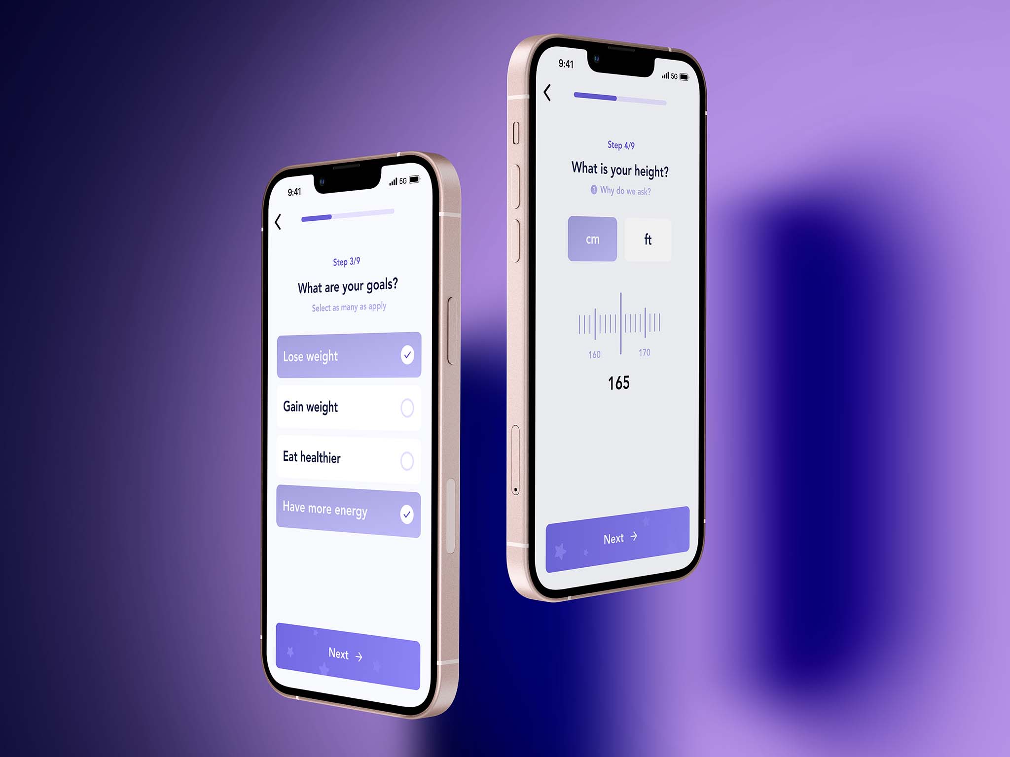
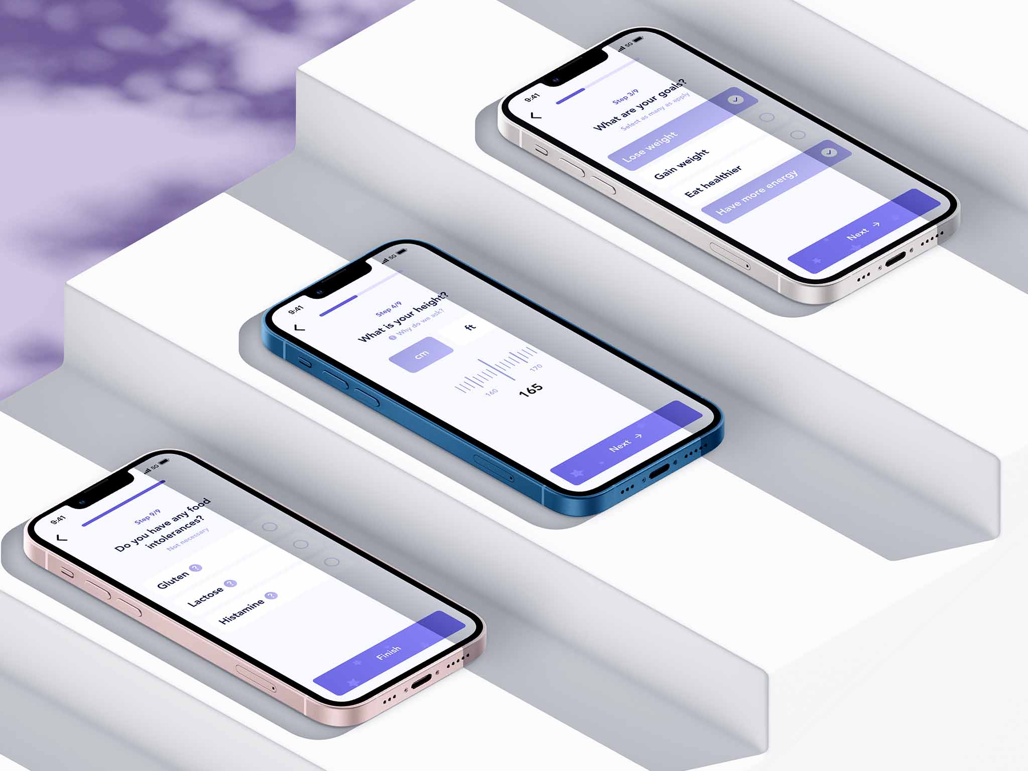
Mockups
High-fidelity prototype
When mockups were ready, I prepared a hi-fi prototype for future usability studies. You can test it following a link at the bottom of this page.
Going forward
Takeaways
Participants of the last usability study shared that the app made it easy to book their first session with a professional nutritionist. Potentially, it could change how they see their diet and eating habits, and, in a long run, improve their health and a life fulfillment.
What I've learned
I've learned that people have fear not of seeking for a professional advice, but of difficult and confusing system of making an appointment in a hospital or a clinic. If we can make this process fun, easy and fully online that would be beneficial to everyone.
Next steps
The next steps would include: conducting a research on how successful the app is in reaching the goal of receiving a professional help on healthy eating, adding more quizzes and trackers for users to keep a record about their eating habits and providing free bonus sessions and discounts for users who successfully keep their daily records.